custom logo
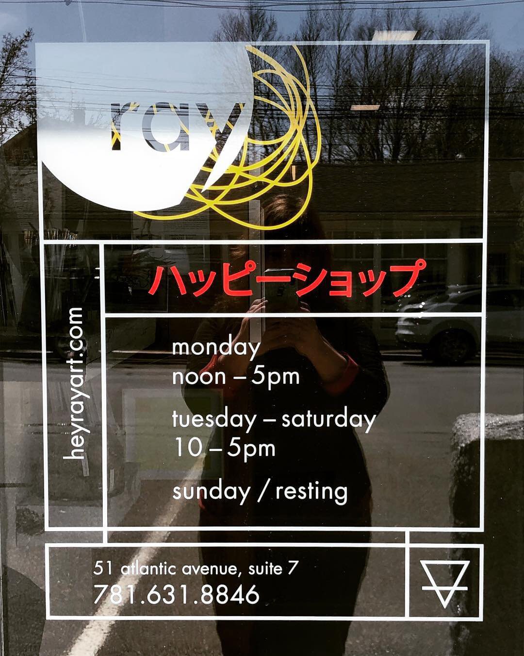
custom door decal
beautiful custom designed and printed tissue paper in black and silver with fun messaging
custom designed signage incorporating rusty metal and wood, and vinyl window decal
store details
magazine ad
custom printer postcard introducing the new name of the store, ray!
/ ray /
visual identity + logo design
art direction
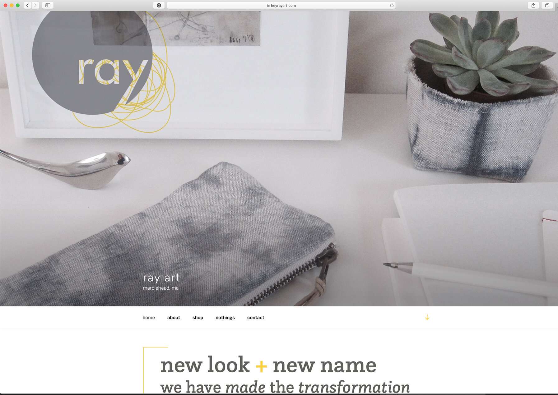
web design
Comprehensive visual identity for ray, a unique custom framing and arts shop with an array of stationery,
art supplies, fine art, and gifts sourced from artisans locally and abroad. WB design tackled the first design “problem”—the very cool owner decided to rename her store to reflect her more modern design aesthetic. The name ray emerged—inspired by designers Charles and Ray Eames, performing artist Ray Johnson, and a ray of light— we had to develop a visual brand identity worthy of this bold new name. The logo has a kinetic energy to it—almost like a creative idea in-the-making, and some of the complementary elements like the door decal are a nod to some of the Japanese products sold at ray. We carried a clean, modern, yet often whimsical feel across various magazine ads, postcards, and of course through her e-commerce website. Since the owner is a lover of detail, she relished in the customization of things large and small—from the storefront sign to a framing sticker—these details are what sets her shop apart.
photography and web development: molly akin


